SEAT N EAT - UX/UI
Food delivery app for live sporting events


General
-
First UX Project
-
Mobile App
-
Sole UX/UI Designer
Methods
-
Ideation/Brainstorming
-
User Research (interviews)
-
Iteration
Deliverables
-
UX Artifacts
-
Wireframes (FIGMA)
-
Prototype (Adobe XD)
-
Mockups (Adobe XD)
Problem
COVID-19 restrictions have eased and sports arenas are back to full capacity, which means large crowds and wait times will once again make ordering food at these events more tedious.
Project Goal
Make ordering food at sporting events less tedious and allow sports fans to spend more time watching the sport they paid to see.
Process

-
Empathize: Conducted user interviews
-
Define: Defined user pain points, organized feedback by creating aggregate empathy maps and personas
-
Ideate: Created mind map of ideas related to problem and created user flow
-
Prototype: Created wireframes and usable prototypes based off prior research
-
Test: Conducted usability tests to identify strengths and weaknesses of prototype as well as iterate based off feedback
1.) Empathize
First I had to understand how potential users of the app think and feel about ordering food at sporting events as well as ordering food outside of sporting events.
Interview Participants
-
8 Participants (4 Male, 4 Female)
-
Age ranges from 19-55 years old
-
All Participants identified as sports fans who have been to a live sporting event within last 5 years
-
2 Participants had dietary restrictions (no pork or beef)
-
1 participant had physical disabilities (herniated disc and frozen shoulder)
Interview Questions
-
Have you been to a live sporting event within the past 5 years?
-
Have you ordered food while at these live sporting events?
-
Do you order food when you are not at sporting events?
-
What method do you use to order food? (Phone, Website, App)
-
What comes to mind when you think back about your experiences ordering food at sporting events?
-
How would you compare ordering food within sporting events to ordering during an ordinary day?
-
How do you feel about the number of food options within sports venues?
-
How would you feel about an app that lets you order food s and have it delivered to your seat at sporting events?
Interview Feedback
-
Long lines to get food can be frustrating
-
Annoying when unable to browse all vendors in arena due to crowded halls
-
Carrying food through crowded lobbies, hallways, and staircases can be stressful
-
Negative feelings due to possibility of contracting COVID-19 due to lack of social distancing
-
Apps like Uber Eats and Door Dash have become integral factors when ordering food in everyday life
2.) Define
I organized the interview responses by creating UX Artifacts such as aggregate empathy maps and personas. Creating these artifacts helped ensure I keep the end users top of mind throughout the design process.
UX ARTIFACTS

First aggregated empathy map that helped create my first persona


First aggregated empathy map that helped create my first persona

Second aggregated empathy map that helped create my second persona


Second aggregated empathy map that helped create my second persona
3.) Ideate
Mind Map
I made this mind map in attempt to discover other aspects of food delivery and sporting events that I might not have thought about that also did not come up in user interviews. This mind map also helped with organizing some feedback I received from users during interviews.

User Flow
This user flow outlines the steps a user would take when ordering food from a vendor and having the order delivered to their seat.

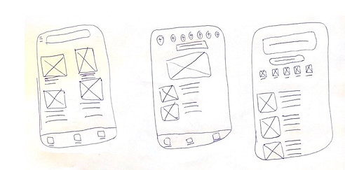
Paper Wireframes
I rapidly created multiple paper wireframes. I took my favourite elements from the first 6 paper wireframes that I made and put them into one paper wireframe that I felt confident in using. I tried to think of Uber Eats, Skip the Dishes, and other similar apps while brainstorming.

4.) Prototype
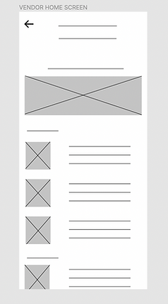
Low-Fidelity Digital Wireframes
For the Seat N Eat home screen I wanted to make it possible for users to find food however they wanted. Some users may prefer searching for vendors via a search bar while some may prefer clicking on a “categories” or “more vendors” button. Additionally, some users may like to scroll on the home page and find something that way. I tried to incorporate multiple pathways for users to find vendors.
This was intended to be a “more categories” button. For those who may prefer searching for vendor options that way.

This element was intended to be a search bar for users who knew exactly what they wanted to eat but did not want to spend time browsing the app.
This clock icon would work to communicate wait times for different vendors. Each vendor would have a clock and estimated wait time.
Low-Fidelity Digital Wireframes

Mid-Fidelity Wireframes


5.) Test
Usability Study Task
Usability Study Findings
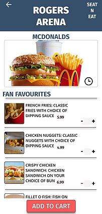
Order chicken nuggets and a crispy chicken sandwich from McDonalds.
-
Users appreciated having ability to find vendors in multiple ways
-
Users were confused by the clock icon as it wasn't explicitly clear what it represented
-
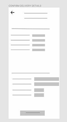
The checkout process was overwhelming due to each screen asking for a lot of information
-
Bottom navigation bar was vague in eyes of some users
-
One user noted that there was no visible way to easily change from one arena to another
Before and After Usability Test


Name of current stadium/arena now includes a drop down menu that indicates users can switch between venues
Clock icon was moved and is now joined by text outlining estimated wait times so it is more clear
Bottom navigation bar now includes images and text for those unclear about what each icon represented


Checkout process was decluttered as delivery location details, payment details, and cost details were separated onto different screens
I used green buttons as opposed to the red buttons from past designs as green is often viewed as allowing progress.
Additional Mockups and Iterations


Takeaways
These designs are a step in the right direction for fans attending sporting events who struggle to order food. The sports fans interviewed discussed the prominence of food delivery apps such as Uber Eats and Door Dash in their everyday lives so there is reason to believe an app like Seat N Eat could be adopted due to familiarity with features, familiarity with design UI, and convenience. Some other key takeaways I take from this project are...
-
It is hard to be "happy" with a final design as I found myself constantly wanting to update the UI and aesthetics
-
Designers should not be emotional, they must make design decisions based off of research rather than their heart
-
User Interviews as well as UX artifacts such as personas, aggregate empathy maps, and user problems are very helpful with guiding the progress of a project while keeping end users in mind
-
After designing on both Figma (wireframes and mid-fidelity prototype) and Adobe XD (final mockups) I feel both have pros and cons
I believe that this was a good first project as I was able to implement many different aspects of UI/UX design. I look forward to one day completing a group project where I can bounce more ideas off of teammates as this would help my iteration and brainstorming process.


